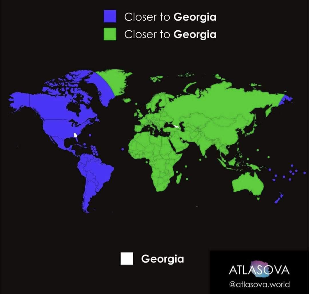
Nah, exactly 50% “of the world” is closer to Georgia than Georgia because the dividing line forms two perfect hemispheres. It just doesn’t seem like it because more of the world’s land area is closer to Georgia.
The fact that the map fails to color in the oceans doesn’t help, of course.
I’m just as annoyed by the overuse of the Mercator projection as the next guy, but no, I don’t think we can blame it in this particular instance. Consider the similar case of a day/night map, which pretty clearly reads as 50/50 even when it’s Mercator:
Add comment