I felt that way about the videos I used to make, but then people watched and commented and I had to deal with that shit and meh. Now I don’t have to worry about being creative and I like it more.
My first project out of college was canceled after a year of hard work. Nothing to do with me or my team. Just the company decided not to do it anymore.
I’ve found that the solution is just not to think about these sorts of things.
The day-to-day work is often rewarding enough, and you’re getting paid because somebody wants you to do it. Make sure that you raise your concerns occasionally, but the rest of the time, just enjoy the daily grind. If you let this stuff bother you, you’ll burn out.
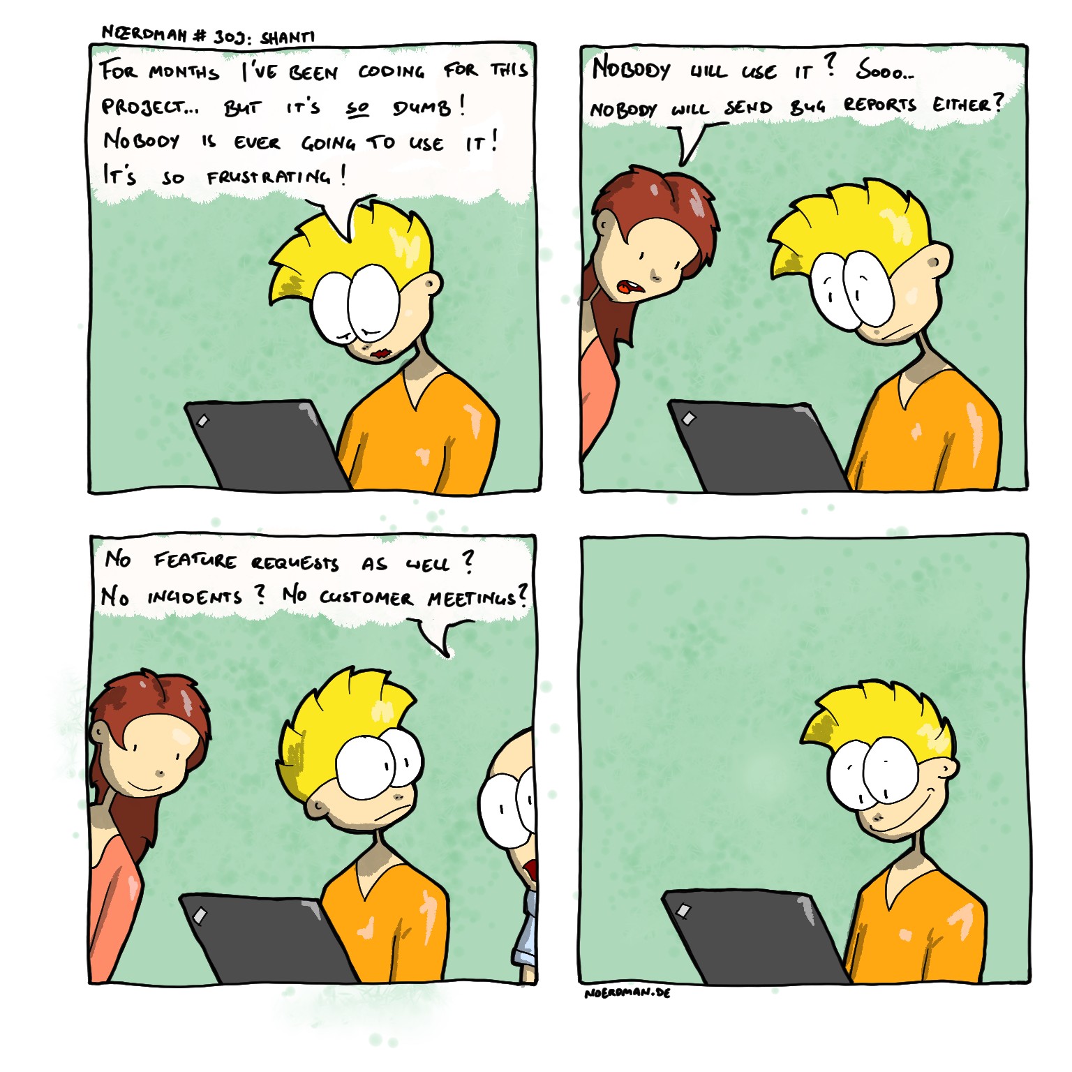
oh it’s actually not a font at all? I mean it’s neater than my hand writing for sure. I think if you try to put a bit more spacing between letters it would help
I think the rough pixelated edges on the brush you used aren’t doing any favors either. Maybe that’s just the compression though? Are you making the comic at a higher resolution then downscaling it for export?
All caps, while being very small and dense. More spacing, bigger size of the words and maybe even the use of non-capped letters would make it easier to read.
First comics didn’t have all-caps-writing and the consensus was that that was much worse… I’ll try to be less dense though. I’ll also work on my handwriting.
Have you thought about simply using a handwritten type font? You could even create a font from your own handwriting so that it still has your style, but you only have to take the time for each letter once.
Or if you want to improve your handwriting, that is also great to strive for I guess. Do whatever brings joy in your life :)


Add comment