there are levels of data hygiene and levels of inconvenience people willing to put up with. Pumping less data points into the machine is still better than pumping more
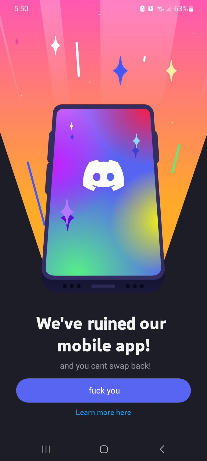
You don't like excessive padding and useless information thrown into your face? The update is just to sell themes and shit on mobile, there was no UX consultation. Download version 205.15 to get the normal UI back.
Granted, apps can lock you out if you don’t have a certain version, but by and large, you should be able to choose to update when there’s this drastic of a change
Can someone explain the update to me . I mostly just use it for one discord server that a smaller streamer that I know personally and haven’t really noticed anything 🤷
It put messages in their own section that is distinctly separate from the server list. A good change in my opinion and they didn’t do it like slack where they took up more screen real estate so there literally isn’t a downside other than “that’s not where I’m used to clicking”
One of the biggest downsides is visible. The color changes make the app unusable for some people and my fiancé had to stop entirely because it gave them a headache every time they tried it no matter what theme they used.
What color changes? If you’re talking about a bug obviously it will be fixed after some time. Other than that I didnt see any color change. I especially like the new nightime theme that is full black.
The default themes (both light and dark mode) are low contrast. I don’t know why anyone would have gray text in light mode but they managed to mess that up.
DMs are now accessible by the menu bar on the bottom. Before it was at the top of the server list
user list is now only accessible by pressing a button on top of the screen
swipe on a message to reply to it.
colours have been tweaked to be less contrasted
As for my thoughts:
IDC about DMs
I look at the user list more often than I reply to people, so I rather swipe to see it. Even more than before, replying only needed a long tap on the message that would be in thumb reach, and now you needed to stretch out your thumb to reach the user list button (that is a search icon)
I don’t suffer from any particular contrast eye issues, but for those that does, contrast is pretty important.
No communication. This update breaks a lot of muscles memory, and it’s forced upon you even if you don’t like it. The old UX was completely fine too.
desktop/mobile discrepancy. Before, mobile was a lot like desktop, but now some thing are moved and you need to learn two interfaces
There is talks that it’s more buggy and slower than before, but I can’t objectively prove it
If you like the new ui, then that’s great. But there’s clearly people who don’t for great reasons.
The reasons might be fine, but my opinion is that is whole thing is a little bit… Blown out of proportion.
Just on a couple of your points:
The muscle memory point is very valid, but that boils down to not liking change for changes sake. Muscle memory can always be rewired, and it will take less time than you think it will.
The discrepancy between desktop and mobile has always been there, imo. So many of the desktop features were crammed away into menus and submenus that were hard to use on mobile. With a new mobile-centric design, we may not know where everything is yet, but it’ll likely be easier to access once we get more familiar with it.
The other thing for me is that Discord is the messaging app I prefer, by a long shot. If they see this as an opportunity to add SMS linking to their feature set, and allow users to then also bridge those from the mobile to desktop version, it would solve a lot of communication issues I have, having everything in one place.
I stopped updating Discord’s app once they did the shitty port of the iOS version to Android. Rolled back to 126.21 and haven’t updated since. Sure some things are bugged, like the new usernames (shows Username#0000 for unique names now but who cares) and the nitro profile animation things. Once that version stops working, I stop using Discord.
They have the same minimalist look now so that makes sense. When I was scrolling I saw the colors and general design of this post and it looked like something reddit do. When i stopped and focused on the post I saw it was Discord.
It’s same recycled design every tech company goes for now.
Yes, their logo redesign hides the gamer origins because Discord has eventually realized everyone uses it and they are trying to appeal to the lowest common denominator nowadays.
slack is paid, irc is a bodge on top of a bodge on top of a bodge, xmpp is rather similar, and matrix… would be nice if any of the clients except element supported any of the features, and also if message synchronization worked more than halfway
Tbh, I would not mind a proper chat standard built on activitypub, it’s obvious that this protocol works, now if only somebody built a secure messaging platform with it.


Add comment