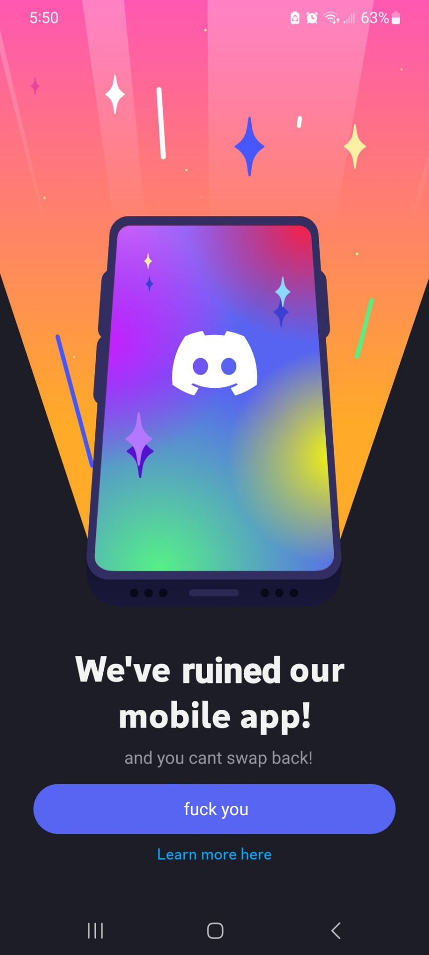
You don't like excessive padding and useless information thrown into your face? The update is just to sell themes and shit on mobile, there was no UX consultation. Download version 205.15 to get the normal UI back.
How the fuck do I see who's online on a server now that I can't open the drawer on the right anymore? I don't use Discord much but I could figure it out.
There’s a chevron next to the channel name, indicating that you can get more details if you tap that. I get that it’s a significant design change but I don’t think it’s that unintuitive.
Not quite. It shows the online status for the people that are in that channel. Not all users are in all channels so, imo, it makes sense. The only complaint I can think of is that you can’t see the status for all of the people in a server.
It's not clear though, because if I reminder correctly, tapping channel names before this update would give you information related to the channel, didn't it?
Barring design changes, Discord changed the user interface of their mobile app that is functionally worse than the old one:
—search results no longer show images and are an endless scroll instead of pages, making it harder to find stuff.
—search function no longer has filters for channels. You have to be in the channel for search results to show, which is not only annoying but is limiting if you’re looking for results across multiple channels.
—can no longer swipe right to show the list of server members. Instead, you have to click on the channel name to see it. However you can still swipe left to show server lists, so it’s inconsistent and breaks muscle memory.
—by default, contact lookup is enabled, which is big privacy violation and isn’t easy to turn off. Such a thing should be opt-in, not opt-out.
—you can no longer see who has DMed you. All you see is a notification in the direct messages button instead of the user’s profile image.
—some users have reported that when they send an image or video in a server, the screen opens to the latest DM instead of that channel. As a result, they’ve seen images and videos to the wrong chat. It might be a bug but, if not, a very poor decision.
—the new dark mode is not accessible to users with vision problems.
—a lot of buttons were moved needlessly, which not only breaks muscle memory but generally isn’t common sense. Some options, like in voice calls, are harder to access now.
A lot of users liked Discord’s simple and intuitive UI. In my experience, the updates in the past weren’t so radical and unpleasant. Such an overhaul is just really disorienting and irritating, does not make for a good user experience.
Also, Discord on Twitter has been dismissive of people’s complaints, telling people to get used to it rather than acknowledging the issues they’re bringing up.
There's lots of information on downloading APKs, the instructions can differ depending on which phone you have.
But essentially you download an APK file from a mirror site and install it. An example being APKMirror, just the APK version will work.
Oh and this is android btw, no idea how you would do it on ios.
They essentially took notifications/settings from the bottom corner and the personal chat section and just made a four panel bottom menu with individual icons for each. They’re simple in aesthetic but fairly clear, in my opinion.
I just hate that I can’t swipe to easily to get to servers from messages anymore. You still can but it takes a second to load now after swiping and it’s not as consistent to get it to do it.
Edit: Also removing the member list for a server being on the right when you swipe is annoying too.
I used the beta UI for a while and imo the new one is worse since it brings backs some of the old UI (i.e. the 1:1 port of the desktop UI for the server sidebar). What they had in the beta UI for server selection was so much better
the drawer was pretty convinient but didn’t work with server folders that well…
also the fullscreen channel list didn’t look good.
the current “new” ui is a nice middle ground
It’s a departure from the desktop UI and it made the whole thing much clunkier.
I will be fair, moving the button to the bottom row is more convenient if you have a lot of servers to scroll up through and use the DMs a lot, I don’t care about that as much.
What I do care about is how the rest of it changed. Can’t just quickly swipe into the DM list and back any more, if you exit the DM that’s it, you gotta click on it again. Switching between DMs and servers is more clunky, a bunch of UI I was actively using is broken up. They broke the search function, and the new way to check channel participants (click on the title) is uncomfortable as hell compared to old “just swipe to the right”.
Personally I hate the new UX even if some bits are an improvement. It’s just too much stuff to change all at once and not for the better.


Add comment