Selecting the New Face of openSUSE is Underway

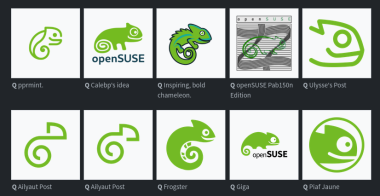
The openSUSE community’s logo contest submission phase is now complete and voting for the logos has begun.

This competition marks a pivotal moment for openSUSE and the voting goes until Dec. 10.

Before making any selections, people are encouraged to visit en.opensuse.org/Logocontest and view the logos before voting.

The number of submissions speaks volumes about the community’s enthusiasm and engagement with 18 submissions for Kalpa, 24 submissions for Slowroll, 21 submissions for Leap, 32 submissions for Tumbleweed and an impressive 36 submissions for a potential new openSUSE logo.

executivechimp,
@executivechimp@discuss.tchncs.de avatar

Bottom row, far right. Simple, minimalist, caffeinated, unhinged.

smileyhead,

People would ask what guy is it

Abnorc,

I don’t hate it. I feel like the goofy smile makes it just distinguishable enough to stick out from all the other minimalist logos.

TWeaK,

Also looks like Toothless from How To Train Your Dragon.

HappycamperNZ,

This is a very important feature

aluminium,

Please not another ultra minimal mono color logo

funkajunk,
@funkajunk@lemm.ee avatar

Too bad for you, they already have the logos for some of the variants and that’s exactly what they’re going for.

https://en.opensuse.org/images/e/ed/Logo_competition.png

aluminium,

Agony

offbyone,

Yeah felt very obvious which ones will be chosen regardless of the survey…

Abnorc,

I don’t feel like they’re inherently bad, but they’ve become so popular that they all feel like they’re blending together. I think it’s kind of stale at this point.

RagnarokOnline,

Bottom row, 2nd from the left. Simple, clean, distinct.

otter,

Does the order get shuffled each time?

SpaceNoodle,

In the thumbnail?

SatyrSack,
demonsword,
@demonsword@lemmy.world avatar

Ailyaut must be a debian fan :)

SpaceNoodle,

No

SpaceNoodle,

Agreed, it really stands apart from all the rest.

Kusimulkku,

Even from the one right next to it that looks almost identical??

SpaceNoodle,

Especially that one.

WhiteHotaru,

These are two variations from the same artist.

Abnorc,

Aliyaut’s logo? It is clean, but it’s hardly even identifiable as a gecko. It blends in too much with all the modern corporate logos we have today IMHO. It’s not a bad choice if they decide to go with it, but they could do better.

toothbrush, (edited )
@toothbrush@lemmy.blahaj.zone avatar

In my opinion one of the full design themes should be picked because some of those single designs look very nice individually but would clash with others.

My pick would be Emiliano’s theme, it looks the most like an evolution of the opensuse style. Imo the others are either a bit too minimalist or deviate too strongly from the original design.

Nikolayan’s design is also good, but I prefer Emiliano’s because that you can recognise the chameleon better in every logo.

WhiteHotaru,

I like this one

https://en.opensuse.org/images/1/1e/Overview_by_pprmint..png

It is a friendly recognizable chameleon and they did a good job with integrating the existing abstract logos.

From the Solo designs I loved the ones with the branch with different endings a lot. It had a warm touch to it, but was a little to filigrane for a logo.

Kusimulkku,

That one is my favourite. Cute chameleon (or was it gecko), but also simple. Looks great

flyos,
@flyos@jlai.lu avatar

Always has been a chameleon. It was named Geeko, which generated some confusion.

EinfachUnersetzlich,

Kinda looks like an embryo to me.

AwwTopsy,

I can’t help but see a squirrel!

adam_b,

Giga and Frogster looks nice

I always lean to logos that also has the name of the company in them, but that’s my personal preference

MDKAOD,

Giga, but tuck openSUSE closer to the mascot. Use the negative space between the feet and above the open in a clever way.

war,
@war@kbin.social avatar

deleted_by_author

  • Loading...
  • Kusimulkku,

    I like the chameleon

    anothermember,

    Is there a reason given why they can’t use their current logo?

    BCsven,

    They can, they just want to change branding to look less like SUSE logo

    Rustmilian, (edited )
    @Rustmilian@lemmy.world avatar

    I really like these two : 10000007851000000786

    Aatube, (edited )
    @Aatube@kbin.social avatar

    too bad they're already doing minimal mono color logos. maybe if one of these designs shifted to adding up all of the colors of the remixes it'd work

    Potatofish, (edited )
    derpgon,

    Can someone explain to me what the fuck are the abominations labeled “Pab150n”?

    nossaquesapao,

    I liked the ones that didn’t stray too much from the original. I always liked the gecko, but found it to be a bit weird looking.

    LunchEnjoyer,
    @LunchEnjoyer@lemmy.world avatar

    pprmint designs are by far superior imo

    AceFuzzLord,

    The survey was absolute hell on mobile until I actually read the part where it says you can just double click. Made it so much easier. I personally chose the more intricate designs as my favorite and less intricate and more simplified designs as my least favorite. Detailed and intricate designs or nothing for me.

    clearleaf,
    Floey,

    The center bottom one looks like the sicp snake.

    kirby, (edited )

    The Leap version logo where there is a line ‘making’ a leap is very clever

  • All
  • Subscribed
  • Moderated
  • Favorites
  • linux@lemmy.ml
  • localhost
  • All magazines
  • Loading…
    Loading the web debug toolbar…
    Attempt #