SVcross,
@SVcross@lemmy.world avatar

Just the picture is ok.

reallyzen,
@reallyzen@lemmy.ml avatar

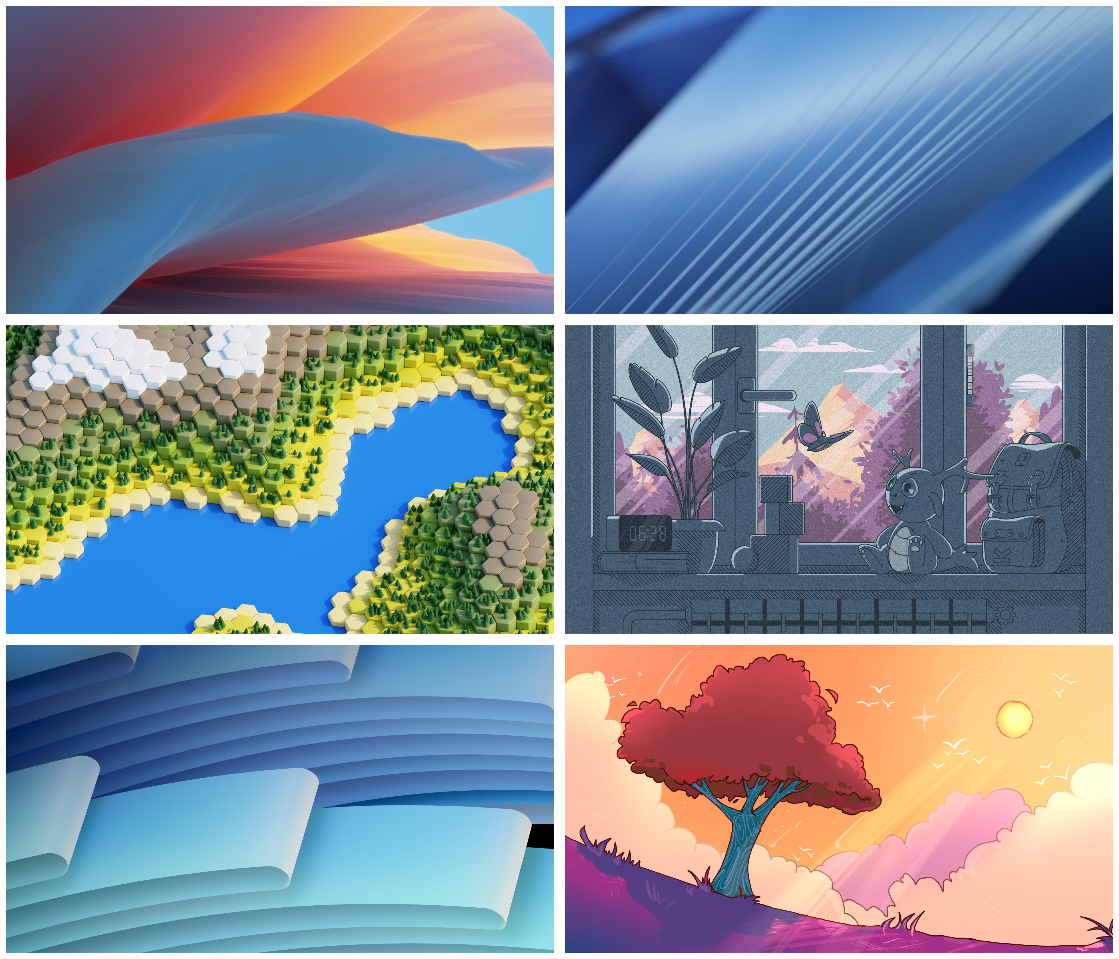
I already installed 6 (the Tree) on my… Gnome laptop. As opposite to one of the feedbacks on the competition page said about the Night version, I don’t care about legibility of my desktop items huhuhu.

danileonis,
@danileonis@lemmy.ml avatar

1

callyral,
@callyral@pawb.social avatar

The middle-right one. Would be nice though if instead of a clock it had something else since it’d be weird to have a static clock.

My secondary choice would be the one with the red tree.

micke,

The red tree 👍

Tier1BuildABear,
@Tier1BuildABear@lemmy.world avatar

The one with the clock better have a moving clock otherwise I hate it. Static clocks should never be part of a wallpaper.

smileyhead, (edited )

3 and 4 are nice but as something someone would set themself. Too much character and detail to be the default when Plasma do not target any specific demographic.

1, 2 and 5 are nice abstract wallpapers, but honestly boring as we have stuff like that for years.

6 is the best. This is wallpaper with some style, but not too much character.

Edit: Just in my opinion and for my eye of course.

archy,

3rd one fits KDE style, also 6 is amazing too

mdk_, (edited )

Top right seems to be the best.

The others:

  • Top left: Mystery tongue coming from or going somewhere
  • Middle left: Much to bright, hard edges make finding icons difficult
  • Middle right: Too many dark areas
  • Bottom left: Might be okay as well
  • Bottom right: Too bright and might not fit the mood as this seems to be an anime inspired background
13617,

LEGO wallpaper for fortnite collab

ProgrammingSocks, (edited )

Default? Top left. It should be visually appealing to most people, and it would honestly just be odd to have the default wallpaper be cartoon styled. And the bottom left looks too much like W11. But I think they should all be included as options.

01189998819991197253,
@01189998819991197253@infosec.pub avatar

In order, starting with most favorite: bottom right, middle right, middle left, top left.

Not a fan of the top right and bottom left.

WalrusByte,
@WalrusByte@lemmy.world avatar

Middle right and bottom right are my favorites

punkwalrus,
@punkwalrus@lemmy.world avatar

I am not wild about any of them, but center left, bottom left are my least annoying. I’ll just change it to something else when i go to Plasma 6 (which I started testing, and while overall it looks great, and is pretty snappy, the Neon Testing is seriously unstable in other areas – but they warn you about that, so that’s on me).

eruchitanda,
@eruchitanda@lemmy.world avatar

I like the vibe of 4 and 6.

Then 5, 2, 1, 3, that have ‘professional’(?) look.

  • All
  • Subscribed
  • Moderated
  • Favorites
  • linux@lemmy.ml
  • localhost
  • All magazines
  • Loading…
    Loading the web debug toolbar…
    Attempt #