Vote on the new KDE Plasma 6 Logo
DISCLAIMER:
Even though this can be a direction, the highest voted icon will not just be taken. Its the choice of the Developers what fits to the project
DISCLAIMER:
Even though this can be a direction, the highest voted icon will not just be taken. Its the choice of the Developers what fits to the project
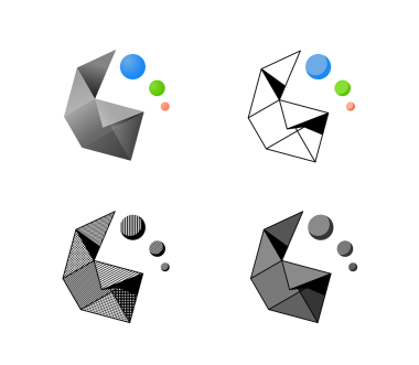
h2anomaly, Triangles i think
chitak166, I’d probably go with fold or circles.
Trinagles are the worst cause there’s not really any ‘shape’ to them. It’s just a triangle with an image.
Rin,
b9chomps, 
Actually, hexagons are the bestagons
Cwilliams, Why is Grey not on Lemmy yet?
Kusimulkku, Not a fan
chitak166, Thankfully we pretty much only see this at the start screen.
isVeryLoud, The “thingy” looks like anal beads.
You’re welcome.
Pantherina, Dolphin crashes for me too currently, some KDEConnect problem
taanegl, (edited ) Anything is an anal bead, if you’re brave enough…
sibloure, (edited ) I guess Triangles. Most of them are too complicated but I guess they suit the KDE experience
Eggshell9808, This doesn’t seem to be an official poll.
Please note that this poll is non-binding and changing the logo will depend on the willingness of the Plasma devs. They will have the final say.
Pantherina, Lol? This doesnt seem very democratic then
OddFed, 
Because no one agreed to a democratic decision. It’s just randomly made up.
jol, Why would it be democratic? It’s just a popularity pool and devs have full control over the direction of the project.
miracleorange, Literally one of the Plasma devs showed up in the thread and seemed very annoyed.
Add comment