They essentially took notifications/settings from the bottom corner and the personal chat section and just made a four panel bottom menu with individual icons for each. They’re simple in aesthetic but fairly clear, in my opinion.
I just hate that I can’t swipe to easily to get to servers from messages anymore. You still can but it takes a second to load now after swiping and it’s not as consistent to get it to do it.
Edit: Also removing the member list for a server being on the right when you swipe is annoying too.
I used the beta UI for a while and imo the new one is worse since it brings backs some of the old UI (i.e. the 1:1 port of the desktop UI for the server sidebar). What they had in the beta UI for server selection was so much better
the drawer was pretty convinient but didn’t work with server folders that well…
also the fullscreen channel list didn’t look good.
the current “new” ui is a nice middle ground
It’s a departure from the desktop UI and it made the whole thing much clunkier.
I will be fair, moving the button to the bottom row is more convenient if you have a lot of servers to scroll up through and use the DMs a lot, I don’t care about that as much.
What I do care about is how the rest of it changed. Can’t just quickly swipe into the DM list and back any more, if you exit the DM that’s it, you gotta click on it again. Switching between DMs and servers is more clunky, a bunch of UI I was actively using is broken up. They broke the search function, and the new way to check channel participants (click on the title) is uncomfortable as hell compared to old “just swipe to the right”.
Personally I hate the new UX even if some bits are an improvement. It’s just too much stuff to change all at once and not for the better.
I hate the new layout. Why are DMs separate from servers? It makes no sense, and it means extra back button presses/swipes to change between them. Why not just have everything in one sidebar which I feel is way more logically consistent and convenient? This update is trash and Discord should feel bad.
Because lots of people thought that the previous ux was idiotic. Why are dms included with servers? That makes no sense? Why do dms disappear from the server list after you open them? It’s idiotic UX and the new way is much better. DMs are always reachable immediately and you don’t have to understand what the icons mean in order to find DMs. For my wife who uses discord maybe ten times a year, this will make her hate discord so much less.
For those of us who use Discord primarily on desktop though, this UI is atrocious. I expect Discord to work like Discord, not <insert other mobile app here>. I like the consistent experience between platforms.
Ultimately though, why can this not just be a freaking OPTION? Just put a toggle in the menu [DMs in Server List] [DMs in Separate Tab]. Bad user experience is forcing all users to conform to the One True Vision ™. Especially when that vision is now horribly disjointed between platforms.
It’s because they rewrote the app from the ground up. They had a lot of issues getting the AMOLED theme to work because the base of the entire thing was written with the idea that there will only ever be 2 themes.
Had to switch my theme back to normal dark from true black cause black usernames weren’t showing. Def some work needed on the he additional theme. Overall digging the update tho
I’ve been using Vendetta with a custom stylesheet for mobile which does the AMOLED theme much better than discord, haven’t used the new app yet and I’m honestly contemplating whether I should get the old android native app running again.
There's lots of information on downloading APKs, the instructions can differ depending on which phone you have.
But essentially you download an APK file from a mirror site and install it. An example being APKMirror, just the APK version will work.
Oh and this is android btw, no idea how you would do it on ios.
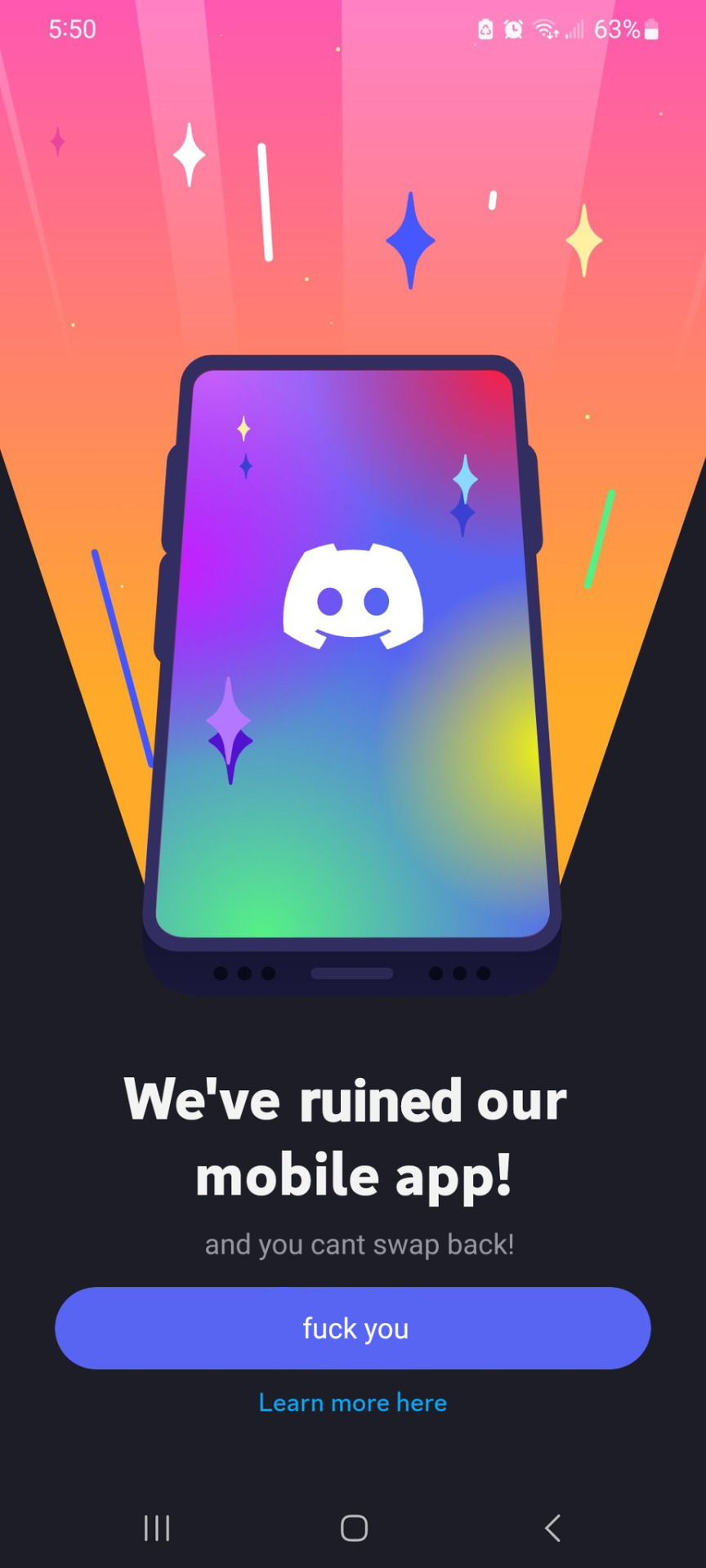
You don't like excessive padding and useless information thrown into your face? The update is just to sell themes and shit on mobile, there was no UX consultation. Download version 205.15 to get the normal UI back.
Have they finally allowed you to set the alert sound in IOS? My problem with mobile discord is the feeble little ding they deem you are allowed to hear is so quiet even with the phone turned up I don’t hear alerts. There are several complaints in their bugtracker about this going back 7+ years, they seem to want people to miss alerts for some marketing/profit reason.
On other platforms you can overwrite the sound file in the package with a proper alert, but not with the “we’re apple, fu and enjoy it” IOS stuff.


Add comment