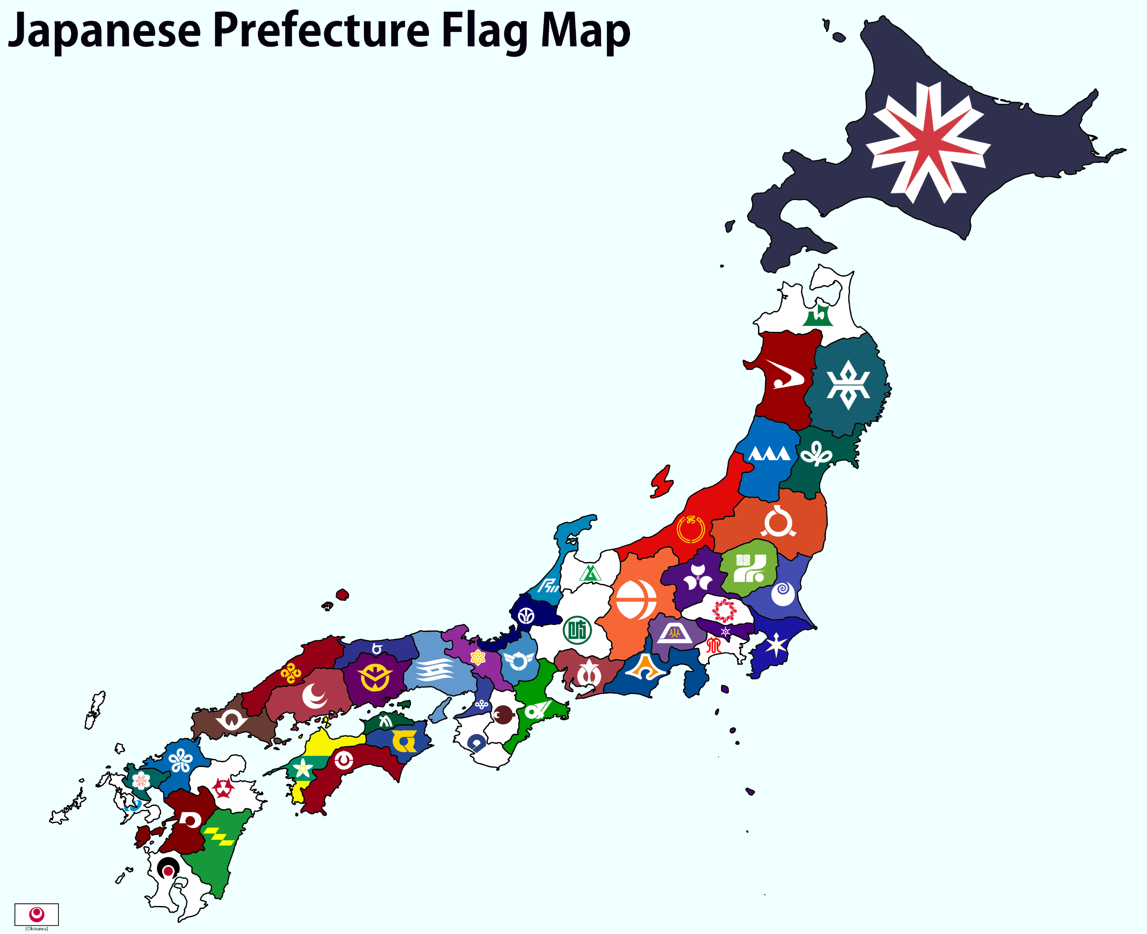
I think they all look pretty cool and have their own distinctive aesthetic while being thematically consistent (e.g. they look like they’re part of the same collection). That being said, I do definitely get “logo” vibes from quite a few, like you could have told me they were sports team logos and I’d believe it. Also Akita straight up looks like a Nike swoosh lol.
i love many of these, but a family crest on a field of color isn’t necessarily the most creative design, but i really like the consistency and history behind some is these. like some of these were flown during the warring states period. that alone makes them kinda cool.
that said, ishikawa looks like a b2b tech company logo.
I don’t even really like flag maps because they ultimately look chaotic, but as all these flags are consistent and simple, this one looks pretty good. I like the flags, while there is a sense of unity, they are all individual as well. I get where people might complain that they look like logos, but they look very modern.
Neat how a few of them are off centre (Nagano, Mie, Fukushima for example). Some appear to derive their symbols from Japanese family crest symbols. And the prefectures with “Yama” all have some sort of mountain range triangular symbolism.
…on the other hand my brain is in the wrong place when I look at the Kanagawa flag.
Add comment