What an evolution 🙄😒

KirbySSM, 
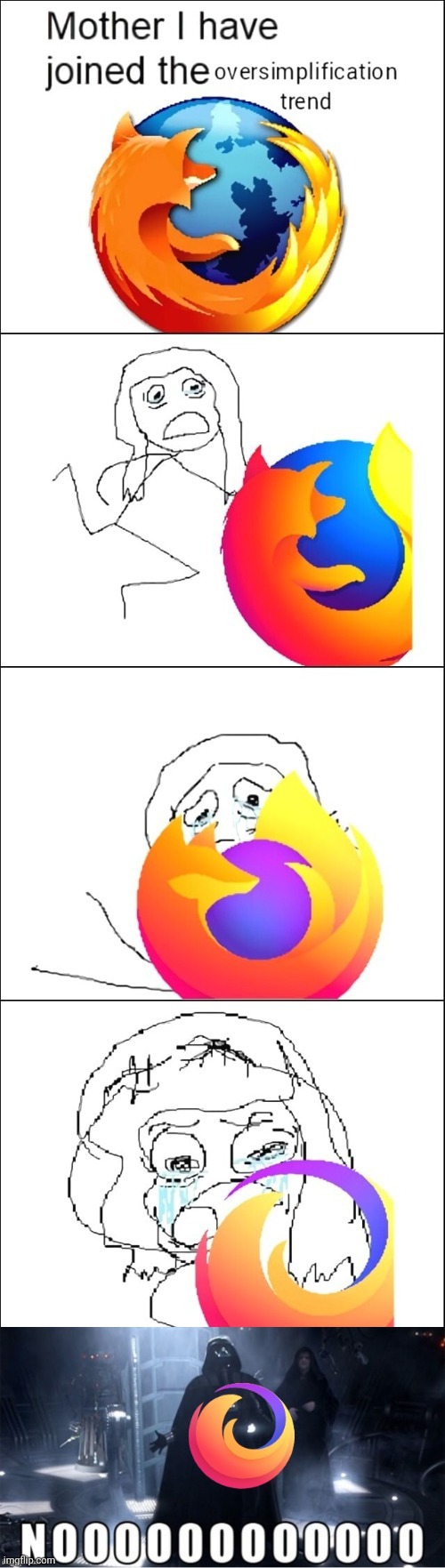
The last one is not the Firefox logo. It’s the logo for the “Firefox Brand” of products (Which includes Firefox, Firefox Monitor, etc.) Firefox the browser uses the second to last logo, and I honestly think it looks pretty good?
GhostMatter,
GrammatonCleric, 
deleted_by_author
KirbySSM, Firefox has been using this logo design before the new Microsoft Edge logo was used
magnetosphere, 
Third panel? Yeah, that’s my favorite, too.
lugal, I’m raised in a time were foxes had forelimbs but you zoomers don’t seem to know such basic biological facts.
Jokes aside, I prefer the second but it’s obvious just my personal tast.
clb92, I’m raised in a time were foxes had forelimbs
…and were bigger than a planet and were made of fire? Sure grandpa, let’s get you to to bed now.
(The second one is indeed really good)
radioactiveradio, You clearly haven’t watched Naruto, unlike grandpa there.
MTLion3, I still think the classic looks better, but 3 is def second best
antonim, The last one is not the Firefox logo, but the general Mozilla Foundation logo.
Source: literally just looking at the icon on your desktop.
I know I shouldn’t be the one to nitpick because I posted a similar “design simplification bad” meme myself just yesterday, but still… :D
evening_push579, I prefer this icon deviantart.com/…/Firefox-Anime-Icon-408401407
BolexForSoup, 
I’ve seen a lot of Mozilla/Firefox hate the last week or two, which is very surprising to me. What is going on?
JackSparrow174, Not me… Firefox is destroying itself.
clb92, No it isn’t?
BolexForSoup, That doesn’t really tell me anything lol
hperrin, Are you dumping your “Firefox Memes” folder or something?
BolexForSoup, Oh are all these posts flooding my Kbin feed one dude?
joelfromaus, 
Seems it. I remember a while back someone started dumping memes on here dunking on something, seems they had a vendetta about some change (someone with a better memory might be able fill in the blanks!). I wonder if it’s a similar thing.
pineapplelover, I use sweet candy icon pack so everything is oversimplified lol.
ISometimesAdmin, 
Same icon pack here!
stoy, The 2009 logo was the best
Viking_Hippie, If I read one more person saying they actually like it because “it’s cleaner”, I’m gonna groan loudly enough that I’ll draw confused stares from one or both of my cats 😖
progettarsi, go on then, i like it because it’s cleaner
Viking_Hippie, I hate to reward you for being annoying, but here’s Charlotte disapproving of you making me wake her from a nap: https://lemmy.world/pictrs/image/c967e39b-c844-413c-8d7c-d81669831b28.jpeg
Viking_Hippie, Just look how annoyed she is at you! https://lemmy.world/pictrs/image/6d7bbb39-1178-4049-9bf8-5cb110c62019.jpeg
0ops, I don’t even agree but upvoted you for your honesty. Fight echo chambers!
Tak, 
I like to too but not because it is cleaner, I just like the void space with a fox tail coming out. Feels like chasing a fox down a rabbit hole kinda thing.
Holzkohlen, Eh, in the end I don’t care. It’s not like I’m gonna switch after all these years.
MrScottyTay, The new logo would be fine if still had even just semblance of a fox head on it
bitsplease, Why do yall care so much about a branding update?
Add comment