abfarid,
@abfarid@startrek.website avatar

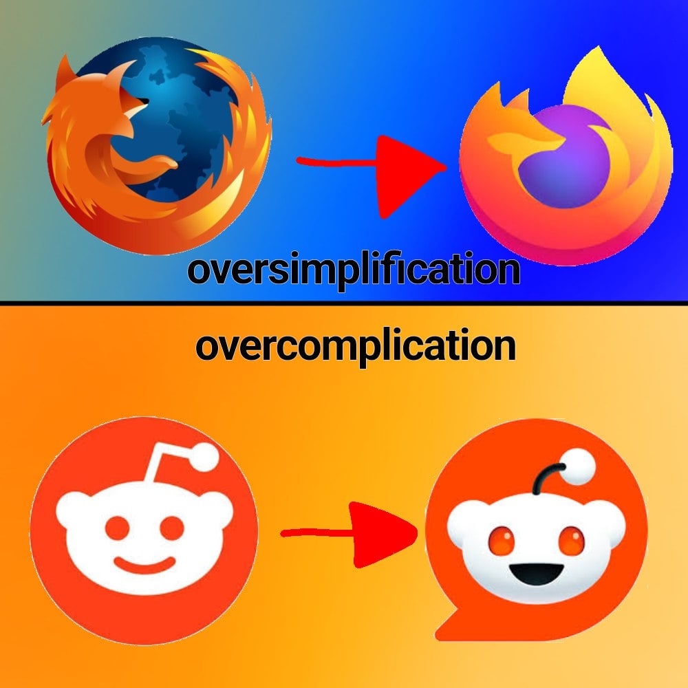
That Firefox logo was simplified, but not oversimplified. Even with a very small icon size you can still tell it’s a fox that is (on?) fire. The Firefox Family logo is oversimplified, just being a swoosh, basically.

vox,
@vox@sopuli.xyz avatar

well the family logo is supposed to be as simple as possible

Mandy,
LinkOpensChest_wav,

I liked this so much more! It was cute and charming.

The new logo looks so office neutral/corporate friendly.

deus,

I still think the 2017 logo was their best, like a nice middle ground between this version and the current one: https://upload.wikimedia.org/wikipedia/commons/1/16/Firefox_logo%2C_2017.png

moistclump,

I like this one. New ones missing the paw and has an odd tail end to me.

sgbrain7,

Those bastards cut off his arm!

fossphi,

This gives me the warm fuzzies

Fridgeratr,

I seem to be the only one who likes the new Firefox logo. It’s way more colorful!

TheGrandNagus,

I think most actually like it more, it’s just people are a lot more likely to come online and make posts if they dislike something.

Octopus1348,
@Octopus1348@lemy.lol avatar

I think the same. The old logo also had a weird Nintendo 64-like 3D.

Ross_audio,

I’d be happiest with the simple one in the old colours.

Orange and blue look way better to me than light orange and purple.

rustydrd,
@rustydrd@sh.itjust.works avatar

You are not alone, we just don’t meme about it.

bi_tux,
@bi_tux@lemmy.world avatar

personally I think it’s not bad, but I still haven’t gotten used yo it

tbh it smh feels like they just changed it a month ago, idk when they actually changed it

AceFuzzLord,

The new logo looks sleek and nice, but I personally just really like more complex logos.

fidodo,

You might like them in isolation but icons need to exist in a lot of uis and contexts so having an overly detailed one will make it look weird when juxtaposed with what’s around it.

fidodo,

I like it too, the old one was too detailed which makes it stand out too much. Icons need to work in a lot of contexts so simpler is almost always better.

accideath,

The old one was great – in the context of late 00s to early 2010s design philosophy. It fit right in with Apple‘s skeumorphic design language and Microsofts Aero design. The new one is the perfect answer to the modern, more minimalist design. (Although I’m glad we’re mostly out of the "flat“ design era of Windows Metro and similar UIs)

JackbyDev,

I miss Aero design so much.

fidodo,

That’s true, it fit in with the trends of the time. I guess part of my feeling is that I never actually liked skeumorphic design so I’ve been happy that flat caught on. There was a period where it did get too flat, but I like the middle ground we’re at now.

Daxter101,

I used to not like the new Firefox logo when it first came out, but by now, I couldn’t do with the old one, it looks so much… And I bet if they changed it back, it would take me 2 months max to switch opinions right back.

At some point I have to accept, I’m just an ape of habit.

gaterush,

I generally agree. However, for the MDN Web docs icon, I’m not sure I’ll ever acclimate to that one, even with how often I see it. so bad. Love MDN still though

BlanK0,

Honestly, its considered a hot-take but I do like minimalistic logos cause they are easier to recognize. Also they tend to better fit with the rest of the UI and products.

ImpossibilityBox,

Counterpoint is the bullshit Google did with all their icons. Same exact colors with different shapes makes quick differentiation an actual challenge. https://lemmy.world/pictrs/image/d271e602-c6de-4313-aae3-fd2b39dbd863.jpeg

poppy,

Why does Drive not match the color tone of the rest of them? It’s so muted.

TheGrandNagus,

Those icons absolutely do not look normal, there’s some kind of theme being applied to all of them, likely a dark mode before it became a standardised feature, by the looks of it.

BlanK0,

Although the icons are kinda not minimal with the amount of colors in there, they could have like made one app with one or two colors and the other with different ones

purplemonkeymad,

And then they introduced to android a new option that only showed the shape of the icon in two tones. Now they have no colour and are just odd shapes.

Holyhandgrenade,
@Holyhandgrenade@lemmy.world avatar

I can’t tell you how often I’ve opened Google Drive when I meant to open the Gmail app or vice versa.
I know they technically don’t look that much alike, but at a glance they’re way too similar. Just use a different color for each app please?

0ops,

That’s gotta be an icon pack, given the black and the weird colors. Am I wrong? Did they change it since I last used the stock icons?

ImpossibilityBox,

I forgot I had an icon pack on. Original is actually worse. No large silhouettes to work with. https://lemmy.world/pictrs/image/af4b5530-bea5-45c6-8eb0-7535235542d3.jpeg

0ops,

Not disagreeing with you there. I wasn’t even much of an icon pack guy until they did the white circle thing. It looks so cheap

Neon,

idk, i like the new Firefox logo

Sylvartas,

Yeah the old one was cool too but I don’t really have anything against the new one either.

Kase,

I like both the firefoxes. They’re good boys!

I also like the old alien. I’m not someone who generally gets upset when companies introduce a new logo, but the new alien is just nightmare fuel. Get away!!

moon,

If they didn’t change the firefox logo, it’d definitely look extremely dated today though

leidkultur,

OP: „I don’t like change.“

sgbrain7,

The Reddit one looks like if they made a mobile game that’s just another Candy Crush clone.

Octopus1348,
@Octopus1348@lemy.lol avatar

Let’s talk about this stupid “Let’s put a useless white background under our icons” trend.

Be honest, which looks better?

https://lemy.lol/pictrs/image/10d4d8d0-ff53-4c35-8ed3-880e394c0d11.jpeghttps://lemy.lol/pictrs/image/03633626-6452-4b1e-a40f-c6be81d3da01.png

beneeney, (edited )
@beneeney@lemm.ee avatar

Google forgor about PNGs 💀

Octopus1348, (edited )
@Octopus1348@lemy.lol avatar

Google also forgot about WebP. A format they created.

fossphi,

Jpeg xl baby!

willya, (edited )
@willya@lemmyf.uk avatar
Octopus1348,
@Octopus1348@lemy.lol avatar

The right answer.

fsxylo,

Oh hey it’s the maps logo, or is that the calendar logo? Nah it’s the files logo. I guess it could be the photos logo…

Really great when I’m trying to find something in a hurry.

Aurix,

The new reddit icon looks like when kids draw on teeth for giggles.

lipilee,

We should call them “oversimplication” and “overcomplification”. Would convey the meaning better :)

rbhfd,

That might make thing overcomplified though

xia,

Just me, or does anyone else see “zombie eyes” in the new reddit logo?

probablynaked,

I just need to know why it has a five o’clock shadow

Default_Defect,
@Default_Defect@midwest.social avatar

Label the whole picture as “Never happy about anything”

camelCaseGuy,

I think the new Reddit logo is hilarious. It looks like Snoo has a stubble. What’s up Snoo? drinking much?

  • All
  • Subscribed
  • Moderated
  • Favorites
  • memes@lemmy.world
  • localhost
  • All magazines
  • Loading…
    Loading the web debug toolbar…
    Attempt #